Electronica Express
Summary
Individual project focused on designing a user-centred prototype for the music streaming app Electronica Express.
Methods & tools
UX/UI, design thinking, research, user interviews, personas, competitive & comparative analysis, wireframing & prototyping, prototype testing, design system, visual design principles, Trello, Figma.
Time frame
Oktober - November 2023
Project context
The music streaming industry is experiencing a period of rapid growth and innovation. The client aims to launch a new streaming service that offers not only high-quality music but also an unprecedented user experience.
Main client's requirements are to:
- Develop an interface that is both functional and aesthetically pleasing.
- Create features for song search, browsing categories, and playback control.
- Include a visual timeline showing how much of the song has been played and how much time is left.
Work stages
In this individual project I applied the design thinking framework to structure my process, ensuring that each stage from research to testing was focused on understanding user needs and translating them into practical design solutions.
Empathise
- I started with reviewing the market and key competitors such as Apple Music, Spotify, YouTube Music and Tidal and running user interviews to learn when and why people listen to music and which music streaming app features they value.
- I analyzed captured stakeholder needs such as a functional and aesthetic interface, robust search / browse / playback, and a clear playback timeline.
Define
This stage I started with framing the target audience - these are people of 30-45 with medium-high income, frequent listeners who value personalisation and quick access to favourites; they search for new music less often. From this, several core problems, user's pain points and possible solutions were identified:
| Core problems | User's pain points | Possible solutions |
|---|---|---|
| Lack of clear entry into the app | New users may feel lost or overwhelmed without guidance | A simple onboarding flow to highlight key features, personalisation settings such as selecting favorite music genres and artists, and clear subscription plans |
| Difficulty finding favourite tracks quickly | Users feel frustrated when they need several clicks to reach their playlists or top tracks | Quick-access navigation (bottom bar) to most usable features, "Recently played" and "Your playlists" sections, pinned favourite artists on the homepage |
| Time wasted searching for new music | Users have to spend time typing or scrolling when they’re busy to find music they want to listen | Smart search with autocomplete and by popular categories, shortcuts for recently played, favorite artists, users' playlists, and contextual suggestions with trending music, new releases, top mixes on the homepage. |
| Limited personalisation in recommendations | Recommendations feel generic, not matching mood or listening habits | Personalised blocks by mood, genre, suggestions with new releases and top mixes based on previously listened tracks, music which are popular among user's friends and a "Surprise me" feature for variety |
| Unclear playback progress | Users don’t always know where they are in a track or can’t easily scrub | A clear playback timeline with visible markers and progress bar |
| Overloaded interfaces | Cluttered design makes it hard to focus, especially when multitasking | A clean, grid-based layout with card patterns, consistent icons, and dark mode as default for comfort and readability |
| Brand identity and recognition | Users may not feel emotionally connected to the product without a distinct style | Applying of a bold colour palette to build recognition, energy, and consistency across the interface |
Ideate
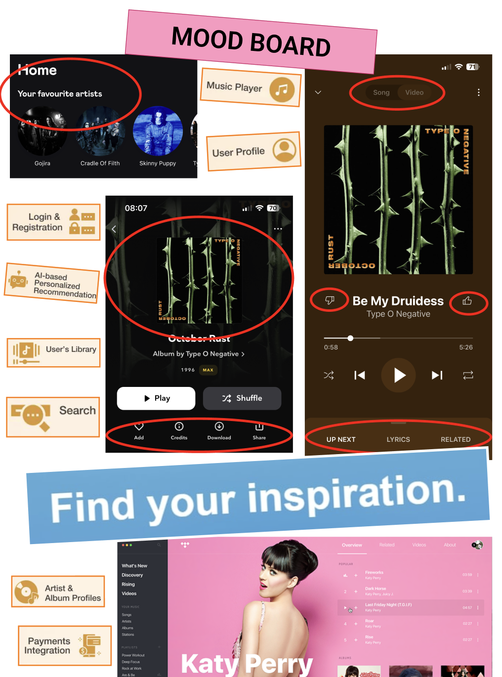
Here I produced persona, user flow and moodboard to explore directions grounded in research.


I decided on following design elements:
- Colour palette. I selected neutral tones (black, grey, white) with orange and green accents. Orange evokes energy and optimism, resonating with millennials (who are my target group), while green adds balance and contrast. Bright and bold colours are used for tooltips, navigation, and highlights to improve readability, and build a strong visual identity.
- Dark mode by default enhances legibility, reduces glare, saves energy on OLED screens which is more sustainable, and ensures accessibility with high contrast.
- Card layout provides a clean structure, making content easy to scan and interact with.
- Typography. I selected Space Grotesk font for its readability and versatility across headings, menus, and buttons. Besides, it looks modern and stylish. Manrope is another font which is used as body text.
- Visual hierarchy and gestalt principles. I followed them to guide attention, support intuitive navigation, and improve usability.
On this stage I also shaped feature concepts such as bottom navigation for fast access and themed recommendation blocks (by mood, genre, etc).

Prototype
At this stage I built low-, mid-, high-fidelity wireframes for onboarding, plan selection, home and mini player, full player, search flows, and a clickable Figma prototype that stitches the journeys end-to-end.


Test
I ran usability testing with 5 participants (35 - 43 years old) using think-aloud approach and interviews. Feedback was positive, and such features as “Surprise me” and bluetooth pairing were noticed and appreciated.

Reflections
In previous projects, I worked in design teams where tasks were divided among members. This project was different: I went through all stages of the design process on my own. This allowed me to explore each stage in greater depth, sharpen my planning skills, and learn how to manage time and scope more effectively. Working individually also meant making all design decisions myself and taking full responsibility for them. This experience made me more confident and courageous in selecting tools, methods, and ideas.
A key takeaway from this project is that uncertainty or lack of information can always be addressed through qualitative research. By grounding decisions in user insights, I was able to reduce doubts and build solutions that better matched user needs.
Overall, this project strengthened my independence as a designer, deepened my understanding of the design process, and reinforced the importance of research-driven design.