Parkster
Summary
Collaborated in a team to improve the information architecture of Parkster’s mobile app, with a focus on restructuring the Support and FAQ pages for clearer navigation.
Methods & tools
UX/UI, agile, user interviews, research, competitive & comparative analysis, information architecture, card sorting, wireframing & prototyping, tree testing, prototype testing, Trello, Figma, UXtweak.
Time frame
November - December 2023
Project context
Parkster AB provides digital parking solutions for municipalities, private companies, and employees. The goal of this project was to redesign the Support and FAQ section of the Parkster mobile app by improving its information architecture. The aim was to make help easier to find, support more consistent, and reduce reliance on staff by empowering users to solve problems independently.
Work process
As a team, we followed a structured UX workflow which included following stages and steps:
1. Research:
- Analysed Parkster’s app and website
- Studied competitor solutions
- Conducted user interviews to understand support needs and behaviours
- Learned previous research data provided by Parkster representative
2. Define:
- Narrowed the target audience to new users, infrequent users, and elderly users
- Identified core problems such as hidden support access, overloaded FAQ, inconsistent language, and unreliable chat
3. Information architecture:
- Created site maps of the current and redesigned support flow
- Worked with metadata, taxonomy, and labelling to organise information logically
- Used card sorting to restructure FAQ into clearer categories and subcategories
4. Wireframing:
- Sketched initial ideas (paper sketches)
- Created lo-fi and mid-fi wireframes in Balsamiq and Figma
- Developed hi-fi wireframes using Parkster’s brand identity (colours, icons, typography) in Figma
5. Prototyping:
- Stitched hi-fi wireframes into a clickable prototype in Figma
- Visualised the new support section flow including FAQ, chat, video guides, and feedback form
6. Testing and validation:
- Conducted tree testing with 5 participants using UXtweak
- Confirmed that redesigned navigation made finding answers faster and easier
My role
In this team project my specific tasks included:
- Research and benchmarking where I analysed Parkster’s app, competitors and support / FAQ pages of other companies (e.g., EasyPark, Skånetrafiken, Ryanair, Nordea, Ikea), and best practices in support design using such tool as Baymard.
- Information architecture (IA) with working on metadata, taxonomy, and labelling to create a more logical structure for the FAQ and support pages. Visualizing of existing and suggested IA.
- Wireframing and prototyping via designing lo-fi and hi-fi wireframes and then stitched them into a clickable prototype to demonstrate the improved user flow.
- Team collaboration. I supported the group by creating site maps, facilitating discussions on navigation, and integrating our research findings into the final prototype.
This combination of individual responsibility and teamwork helped ensure our redesign was both user-friendly and well-aligned with the project goals.
Solutions
Based on research, testing and company's requirements, our proposed solutions included:
1. Changed information architecture:
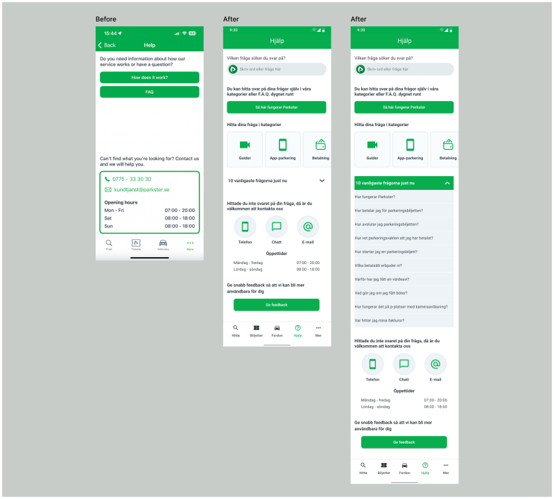
- Support was moved into the main navigation menu and reorganised with clearer flows. It helps users reach answers faster with fewer steps, reducing frustration and improving efficiency.
- Support channels were prioritised according to company goals: phone and chat first, email last. It aligns with Parkster’s requirement to reduce email traffic while giving users quicker, more personal support options.
2. Restructured FAQ and categories:
- Each category was presented as a card with icons and labels, making scanning easier.
- We simplified FAQs, removed duplicates, grouped questions into logical subcategories, and reorganised content by relevance. We placed FAQs in drop-down menus and applied horizontal scrolling for easier navigation. These solutions allow to reduce cognitive overload, makes answers easier to find.
3. Consistent language and labels:
- We unified tone of voice and standardised section names.
- In existing app the languages, Swedish and English are mixed, so we suggested to keep content in Swedish or in English only depending on language selected by user.
These changes avoids confusion, improves trust and readability.
4. Reliable chat and multiple support channels:
- A visible chat button in the support menu was added, with a chatbot fallback when staff are unavailable.
- Also clear options for phone and email were added.
5. Additional features:
- We suggested video guides for new users to improve onboarding and quickly learn main functions.
- We also added feedback form to gather insights from users for continuous improvements.
Reflections
Working on this project together as a team taught me a lot. We went through every step of the design process, from research to prototyping, and I was deeply hands-on with each stage.
I took responsibility for information architecture and wireframes – contributed by restructuring Support and FAQ content, creating clear navigation flows, and visualising solutions that improved usability.
I learned better to base design decisions on evidence – using competitor analysis, card sorting, and tree testing taught me how research and usability testing directly support design choices.
In the end, I gained confidence while collaborating – I grew more self-assured in making design decisions, while also learning how teamwork and collective critique can lead to more user-centred results.


