Skate or Die
Summary
Collaborated in an agile team to design the interface of a mobile e-commerce app for youth skateboard clothing. UI is both in English and Swedish.
Methods & tools
UX/UI, agile (lean & scrum), user interviews, personas, competitive & comparative analysis, wireframing & prototyping, prototype testing, Trello, Figma.
Time frame
September - October 2023
Project context
The startup Skate or Die needs an e-commerce website. The primary target audience of Skate or Die are young people aged 15–25 with an interest in skateboarding culture and street fashion (End users). They value individuality, bold self-expression, and a provocative “make a statement” style, which is reflected in the brand’s tone of voice. For these users, the site needs to be visually engaging, easy to navigate, and social-media friendly, with features like wishlists, product sharing, and custom t-shirt creation.
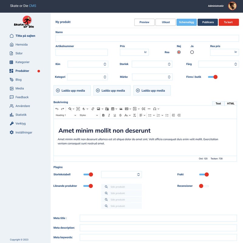
A secondary target audience includes the site administrators, store managers and site owner (Admin / owner), who need an intuitive CMS to easily manage categories, products, images, and collaborations.
Our teamwork was based on the principles of Agile methods such as Scrum and Kanban. Every week we received backlogs with a list of tasks / user stories from the site owner, and also held daily meetings to discuss the current work.
A partial backlog we worked on:
My role
My role in the project involved researching and analyzing competitors, creating a mood board to generate ideas for subsequent teamwork, wireframing and prototyping for the Content Management System (CMS) and shopping cart.
In the process, I designed for two different target audiences: the people running / administrate the site and end users. End prototypes showcase the addition of categories / items to the site and order processing.
Solutions
When developing the CMS, I focused on the needs of business owners and content managers who typically work on desktop computers in offices or from home. Managing an e-commerce site with numerous products on a mobile device is inconvenient and time-consuming, so here I prioritised a desktop-first design for efficiency. Main solutions include:
- Standard CMS structure: using familiar layouts reduces the learning curve, allowing staff to start managing content quickly.
- Recognisable icons and clear labels: helps users find functions fast without unnecessary training, saving time for the company.
- Desktop-focused workflow: improves speed and accuracy in managing large inventories, reducing errors and frustration.
For the checkout process, my goal was to create a smooth, trustworthy, and easy-to-follow experience that motivates users to complete their purchase:
- Step-by-step wizard: breaks the process into clear stages (contact, shipping, payment), lowering cognitive load and reducing cart abandonment.
- Progress indicator: shows users how far they’ve come and how many steps remain, reducing uncertainty and improving confidence.
- Editable order details: users can double-check and adjust items, delivery info, or payment without restarting, which reduces mistakes and support requests.
- Visual trust elements (product image, prices, shipping costs, safety information): builds credibility, reassures users about their choices, and increases the likelihood of completing the transaction.
By combining these solutions, the design not only improves usability for customers but also optimises workflow for the business, resulting in smoother operations, stronger trust, and higher conversion rates.
Reflections
This project taught me several valuable lessons. I realised the importance of working within my capabilities and focusing on user stories instead of adding unnecessary features. I also learned to rely on established design patterns - familiar, user-friendly, and time-tested - rather than reinventing the wheel. User needs guided every design decision, from choosing the right device for development to creating clear visual and information hierarchies.


