Project overview
My role
UX researcher / UX designer
Team
5 designers
Client
Doro
Client
Smart home devices / B2C
Platform
Physical device / Mobile app
Tools
Figma
Methods
Secondary research · Surveys · Interviews · Usability testing · Cognitive walkthrough · Affinity mapping · Insight statements · Personas · How might we · Wireframing · Interactive prototyping · A/B testing
Time frame
3 months (October - December 2024)
The Challenge
Doro develops products that help older adults live independently. Our team partnered with Doro to evaluate the onboarding experience of the Doro Hemma Doorbell and identify opportunities to improve it.
Although the task initially appeared to focus on the mobile application, our research quickly revealed a much broader problem. Installing the doorbell required users to switch between printed instructions, physical hardware, Wi-Fi settings, emails, QR codes and the mobile app.
Older adults were not struggling because of the technology itself. They were struggling because the onboarding experience required them to navigate multiple disconnected touchpoints while already feeling uncertain about using new technology.
Understanding the Experience
Inspiration phase
Designing an accessible onboarding experience required understanding far more than the interface itself.
Before designing solutions, we wanted to answer three questions:
- How do older adults interact with smart home technology?
- What prevents them from completing the installation independently?
- Why do many rely on family members for technical support?
To answer these questions, we combined interviews, surveys, Think aloud usability testing, Cognitive walkthroughs and secondary research. We also evaluated the onboarding experience using SUS, UEQ and SEQ, allowing us to support qualitative insights with measurable usability data.
My contribution
I contributed throughout the entire research phase, helping plan, conduct and synthesise user research.
I was responsible for:
- Planning research activities, including interview guides, surveys, participant consent forms and usability questionnaires (SUS, UEQ and SEQ).
- Conducting research through interviews with older adults and family members, survey distribution and a Cognitive Walkthrough using the Doro Doorbell and companion app.
- Performing secondary research on Doro, competing smart home products, accessibility and the needs of older adults.
- Analysing qualitative and quantitative data, including survey results, SUS, UEQ and SEQ scores, and organising Affinity Mapping to identify patterns and key insights.
These findings formed the foundation for personas, design opportunities and the decisions made throughout the rest of the project.
My Role
I contributed throughout the entire User-Centred Design process as both a UX Researcher and UX Designer.
I planned and conducted user research, including interviews, surveys, secondary research and a Cognitive Walkthrough using the physical Doro Doorbell and mobile app. I analysed qualitative and quantitative findings, calculated System Usability Scale (SUS), User Experience Questionnaire (UEQ) and Single Ease Question (SEQ) results, and transformed research insights into personas, How Might We questions and design opportunities.
As a UX Designer, I worked on wireframes, interactive prototypes, usability testing and design iterations, ensuring that every design decision was grounded in user research rather than assumptions.
Throughout the project, our team collaborated closely with Doro's usability specialist, allowing us to validate ideas against real product constraints and present recommendations directly to the company.
Research
Methods
- Theoretical research – reviewing WCAG 2.2 AA, POUR, inclusive and universal design principles, IKEA internal accessibility guidelines, and best UX practices.
- Content audit – analysing microcopy, labels, placeholders, alt text, and abbreviations to identify accessibility barriers.
- Assistive-technology testing – using the VoiceOver screen reader to detect navigation, labeling, and responsiveness issues.
- User and expert feedback – gathering insights through Accessibility Fika sessions with IKEA employees (including users with disabilities) and internal experts in UX, writing, and development.
Identified issues
-
Abbreviations and acronyms in filters and buttons caused confusion.
-
Frequent ALL-CAPS and capitalised microcopy reduced readability.
-
Missing or unclear labels and inconsistent placeholders made navigation unpredictable.
-
Keyboard navigation and screen-reader support were incomplete or inconsistent.
-
Interface relied on colour alone to communicate states.
-
Language and retail-unit selectors were not announced to assistive technologies.
-
Image alt texts were long, system-generated strings that provided little meaning.
- Use of typographic signs (like “&”) in labels caused incorrect or missing pronunciation by screen readers.

Impact on co-workers and users with disabilities
Blind or low-vision users
Struggle to navigate due to unlabeled controls, missing roles, and poor contrast
Colour-vision deficiencies
Can’t perceive status information shown only by colour.
Cognitive differences
Face higher effort and more errors from abbreviations and inconsistent copy.
Keyboard-only users
Can’t move smoothly through the page because some elements don’t get focus or trap the cursor.
Screen-reader users
Struggle to understand page structure because some buttons and labels aren’t described properly. Symbols like “&” or “/” are read aloud in full, which makes names and phrases sound confusing.
New co-workers
Often face confusion and slower onboarding when the tool uses unclear terms, abbreviations, making it harder to learn and navigate independently.
Non-native speakers
Struggle to understand unclear or inconsistent wording, especially in elements like the language selector or filters. Ambiguous terms and abbreviations make it harder to find the right option and complete tasks confidently.
All co-workers
Experience reduced efficiency and independence due to unclear, inconsistent copy and use of abbreviations, especially in time-pressured environments like stores where quick task completion is essential.
Content design workflow

During the work process I collaborated closely with accessibility specialists, designers, writers and developers to ensure every change in wording or component behaviour improved both clarity and technical accessibility. Together we reviewed proposed updates, verified them against WCAG standards, and discussed implementation details in the design system.
Before
Search field / placeholder

Key problems:
- No label.
- Placeholder text is too long and lacks clarity.
- Capitalization.
- No keyboard navigation and screen readers support.
After

What has changed:
- A visible label added for clear context.
- Placeholder text shortened.
- Capitalization replaced by sentenced case.
- "X” (clear) button in placeholder added to delete typed text if needed.
Filter pills and buttons

Key problems:
- Unclear and vague microcopy.
- Capitalization.
- Lack of keyboard navigation and screen readers support.

What has changed:
- Clear and descriptive labels used.
- Capitalization replaced by sentence case.
Language selector

Key problems:
-
Language selection component (dropdown) is inconsistent.
- Unclear labeling - vague division for English language into "Official English" and "English".
- All languages listed in English by default.
- No ARIA support for dynamic updates - when a retail unit is selected, the language list updates, but screen readers do not announce the change.
- Lack of proper keyboard navigation.

What has changed:
- Language selection component (dropdown) became consistent due to using component from design system.
- Clear labels used for division for English - standard and localized English variants: English (US), English (UK), English (Canada), etc.
-
Language names used in their native form, e.g., "Français" instead of "French",
“Svenska” instead of “Swedish”, etc.
- If there is English in the list, it comes first by default.
Filters

Key problems:
- Unclear and vague microcopy.
- Capitalization.
- A lot of abbreviations without explanation.
- Lack of keyboard navigation and screen readers support.

What has changed:
- Radio buttons were replaced by checkboxes providing a user a multi-optional choice. As user can choose more than one alternative there is no need to use unclear option "Yes/Not Yet" anymore.
- Capitalization replaced by sentence case.
- Tooltip on hover added for abbreviations.
Creating guidelines
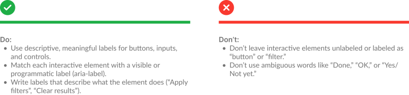
The final step of the project was transforming all research findings and accessibility issues into a set of clear, actionable UX writing guidelines. These guidelines translate accessibility principles into practical rules for everyday work, helping designers, writers, and developers create consistent, inclusive interfaces across IKEA internal tools. Here is an excerpt from the guides.
General writing guidelines

Labels and microcopy
Placeholder text

Alternative text

Outcomes

Recommendations for future work
- Test with more diverse co-workers and roles.
- Include additional assistive technologies (e.g. NVDA, JAWS).
- Refine keyboard navigation and focus order.
- Improve screen-reader feedback for all interactive elements.
- Include accessibility in all development stages.
- Build a shared accessibility library for future projects.
Reflection
This project strengthened my understanding of how language directly impacts accessibility and daily workflows. Working within IKEA internal environment showed the importance of collaboration between roles and how even small text or structure changes can remove barriers. With more time and broader testing, the results could evolve into a scalable model for accessible writing across all IKEA digital tools.