Doro Hemma Doorbell
A 12-week industry collaboration with Doro, redesigning the onboarding experience for older adults through user-centred research and design
Project overview
My role
UX researcher / UX designer
Team
5 designers
Client
Doro
Industry
Smart home devices / B2C
Platform
Physical device / Mobile app
Tools
Figma
Methods
Secondary research · Surveys · Interviews · Usability testing · Cognitive walkthrough · Affinity mapping · Insight statements · Personas · How might we · Wireframing · Interactive prototyping · A/B testing
Time frame
3 months (October - December 2024)
The Challenge
Doro develops products that help older adults live independently. Our team partnered with Doro to evaluate the onboarding experience of the Doro Hemma Doorbell and identify opportunities to improve it.
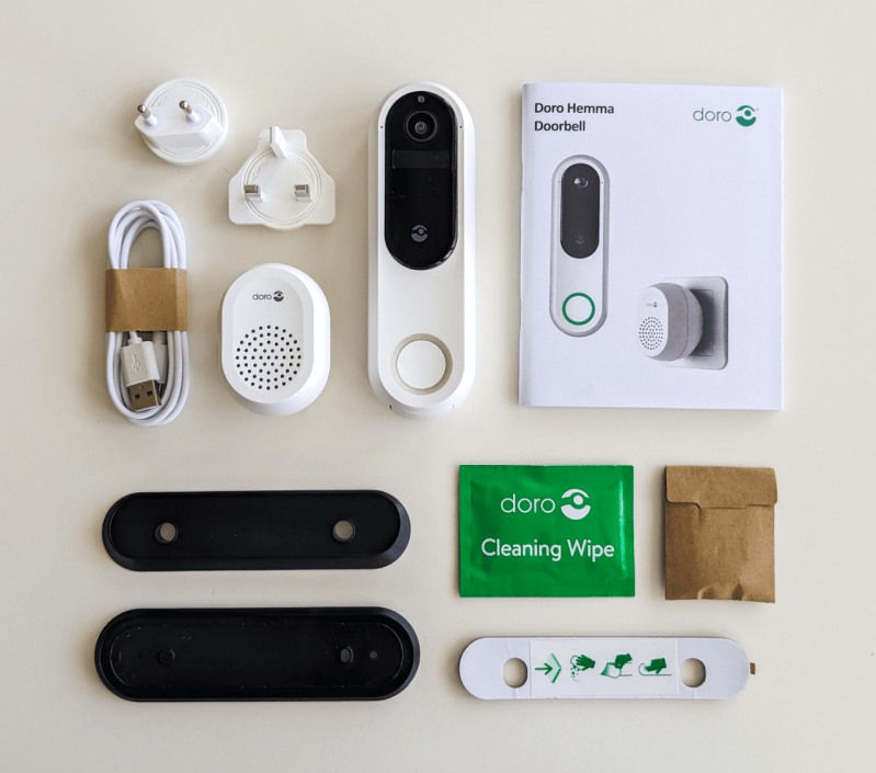
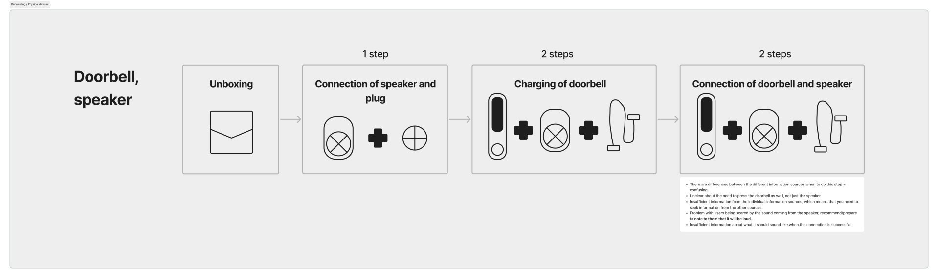
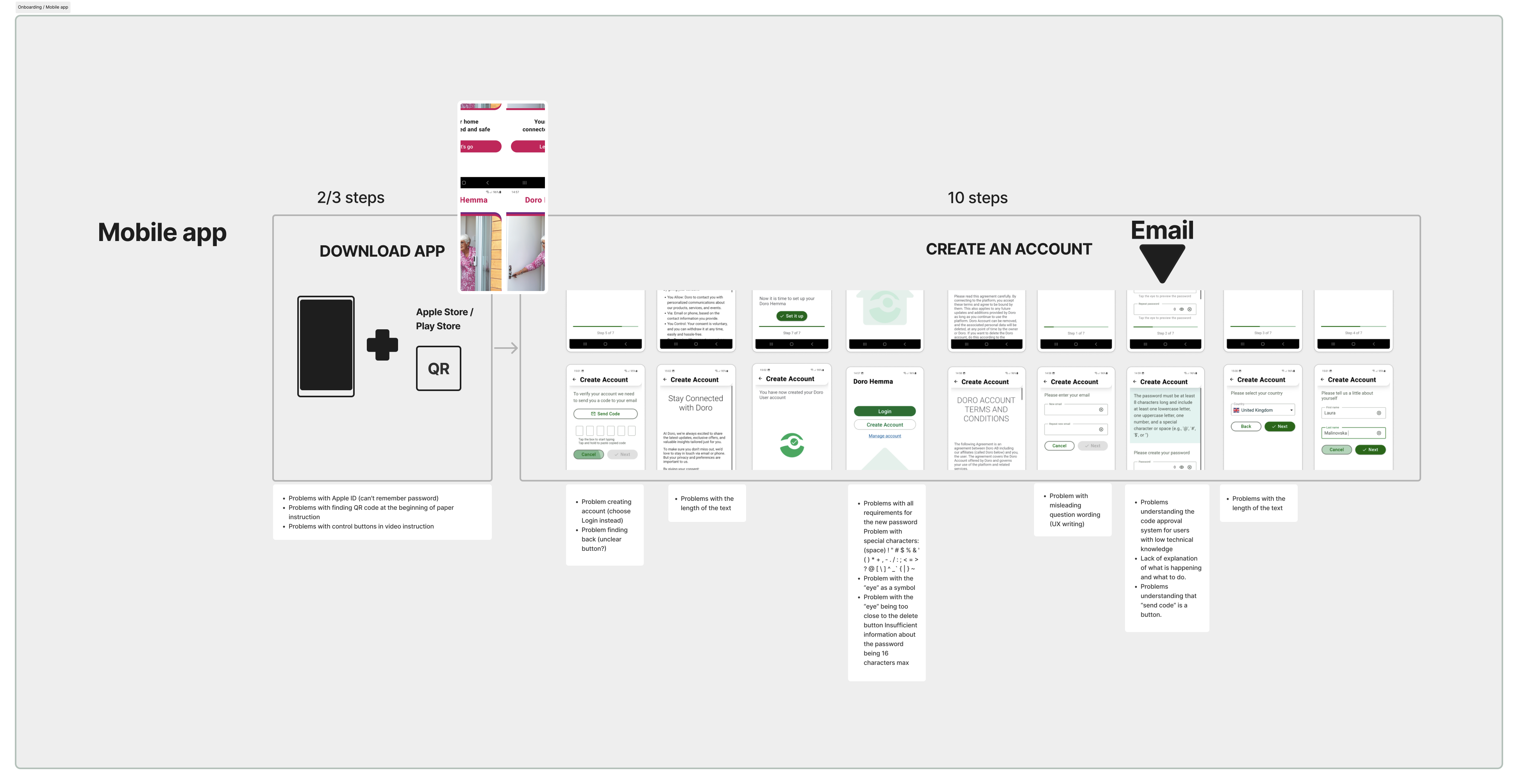
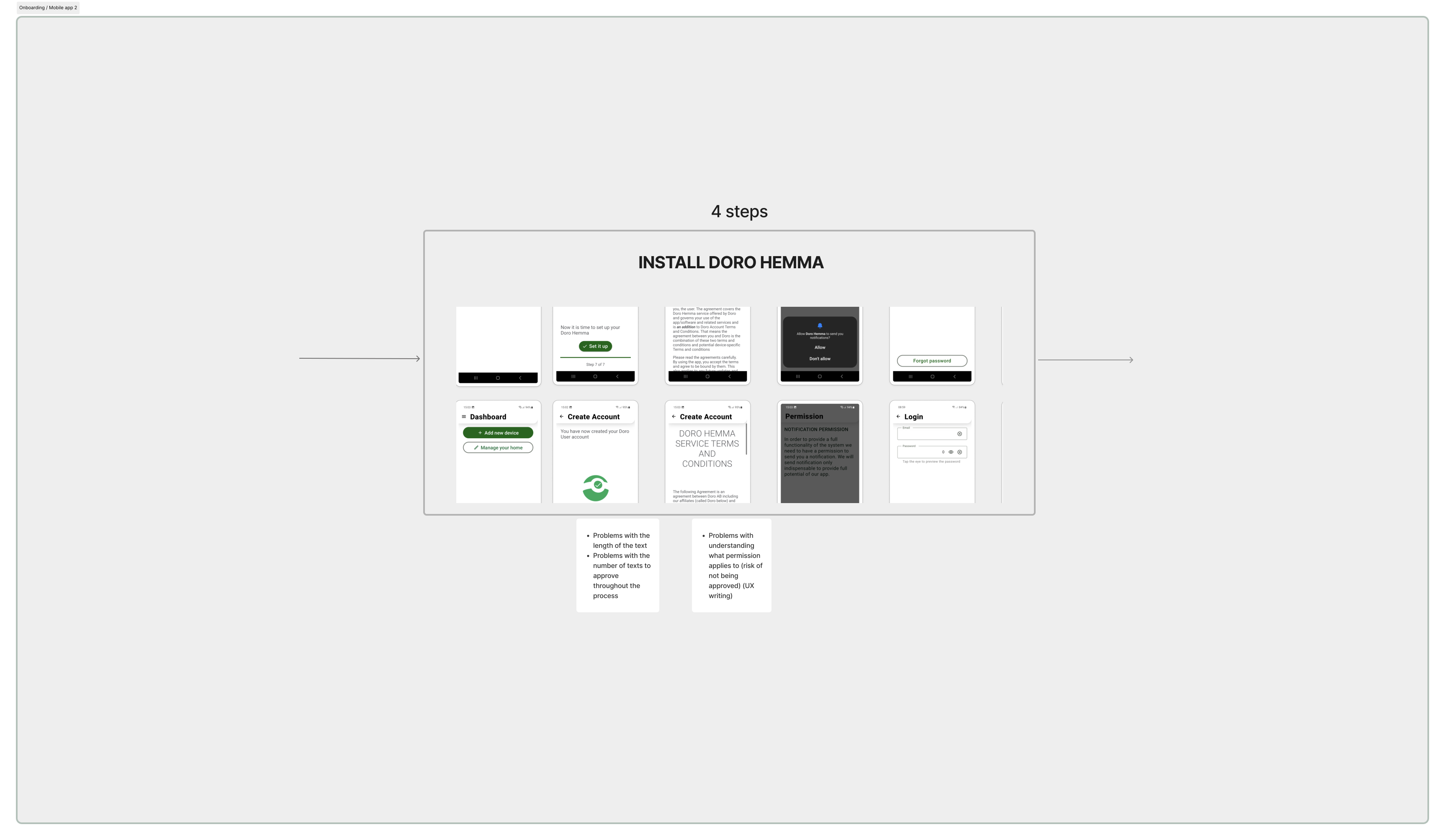
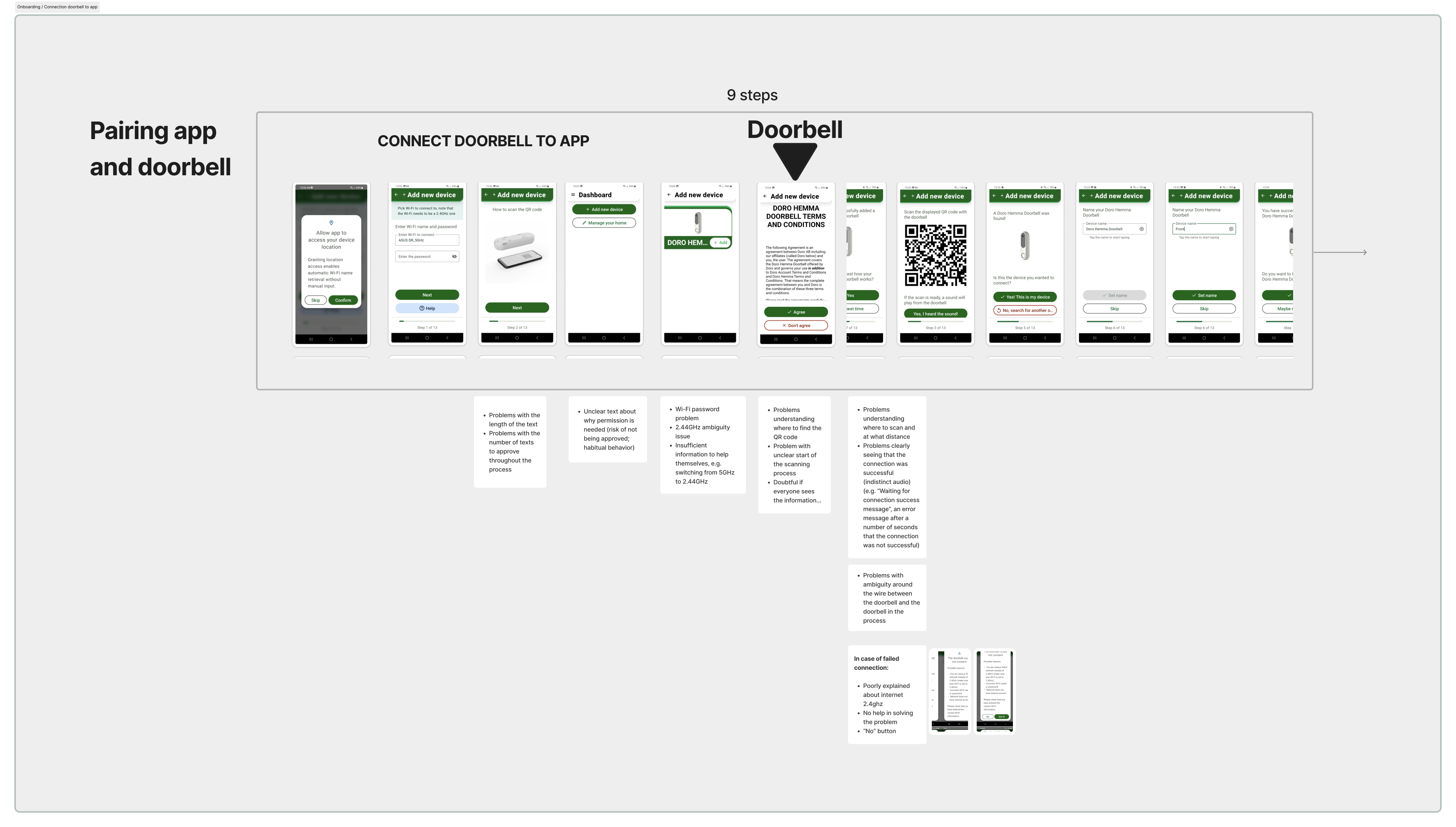
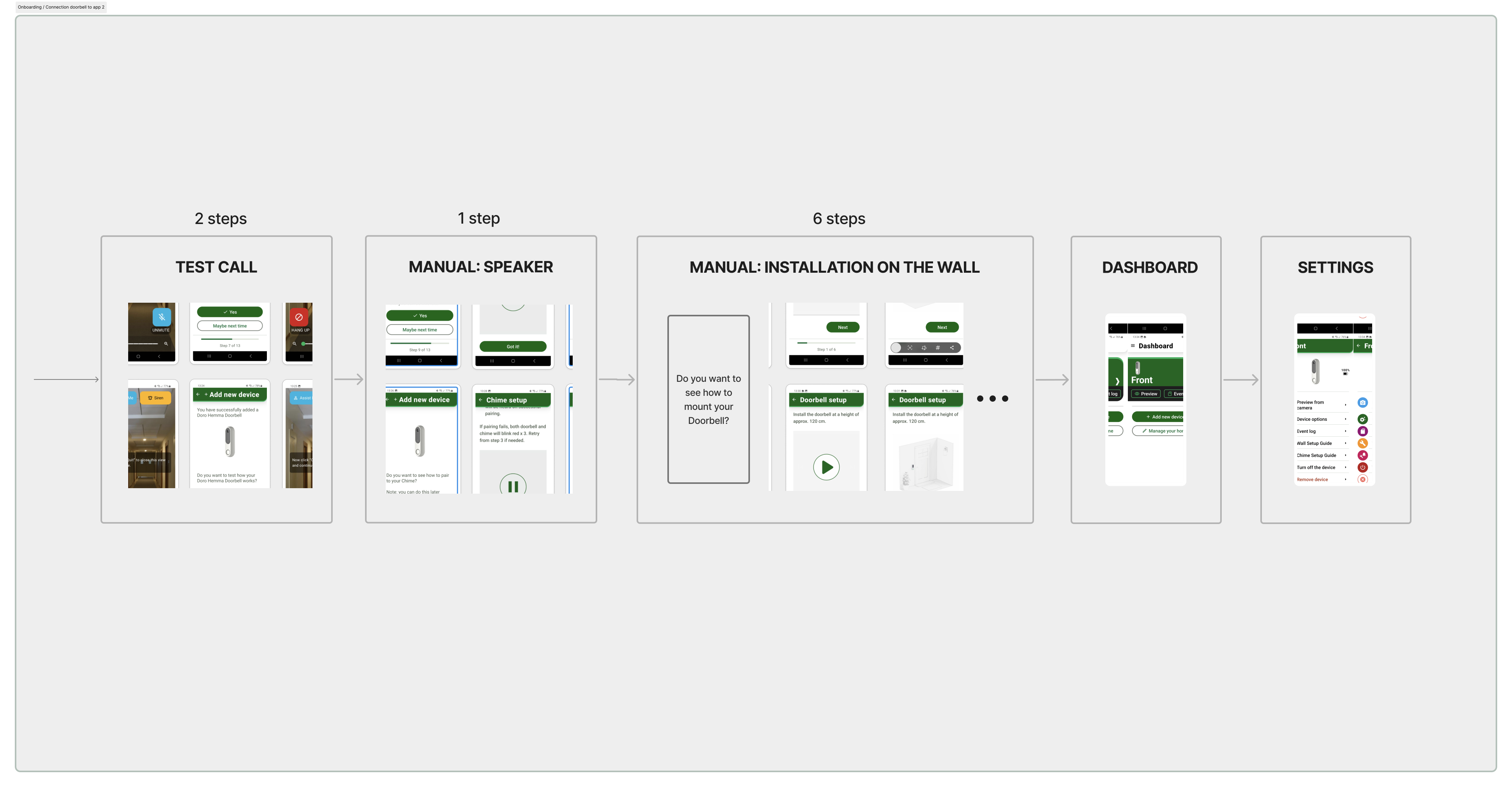
Although the task initially appeared to focus on the mobile application, our research quickly revealed a much broader problem. Installing the doorbell required users to switch between printed instructions, physical hardware, Wi-Fi settings, emails, QR codes and the mobile app.
Older adults were not struggling because of the technology itself. They were struggling because the onboarding experience required them to navigate multiple disconnected touchpoints while already feeling uncertain about using new technology.
Understanding the Experience
Research: Inspiration phase
Designing an accessible onboarding experience required understanding far more than the interface itself.
Before designing solutions, we wanted to answer three questions:
- How do older adults interact with smart home technology?
- What prevents them from completing the installation independently?
- Why do many rely on family members for technical support?
To answer these questions, we combined interviews, surveys, Think aloud usability testing, Cognitive walkthroughs and secondary research. We also evaluated the onboarding experience using SUS, UEQ and SEQ, allowing us to support qualitative insights with measurable usability data.
My contribution
I contributed throughout the entire research phase, helping plan, conduct and synthesise user research.
I was responsible for:
- Planning research activities, including interview guides, surveys, participant consent forms and usability questionnaires (SUS, UEQ and SEQ).
- Conducting research through interviews with older adults and family members, survey distribution and a Cognitive Walkthrough using the Doro Doorbell and companion app.
- Performing secondary research on Doro, competing smart home products, accessibility and the needs of older adults.
- Analysing qualitative and quantitative data, including survey results, SUS, UEQ and SEQ scores, and organising Affinity Mapping to identify patterns and key insights.
Key Insights
Our research revealed that usability issues were not caused by a single interface problem. Instead, they emerged throughout the entire onboarding journey.
01. Installation felt overwhelming
Observation
Users were required to interact with several different touchpoints before completing the installation, making the onboarding process feel more complicated than expected.
Evidence
Users switched between the physical device, printed instructions, QR codes, emails, Wi-Fi settings and the mobile application.
Design opportunity
Create a more connected onboarding experience that guides users through each step with greater clarity.
02. Confidence mattered as much as usability
Observation
Many participants became uncertain when they encountered unexpected steps, even when they were technically able to continue.
Evidence
Usability testing showed that uncertainty often led users to stop, hesitate or seek help before completing the installation.
Design opportunity
Reduce uncertainty by providing clearer guidance, feedback and reassurance throughout the onboarding process.
“I feel insecure about installing new app or dealing with new technics. Rather, I feel dependent on outside help.”
"It feels difficult and daunting because there are so many new features that I've never been close to before."
"I feel completely unsure when it concerns using new products or installing new app. I am a complete layman in these matters. Either my wife or my work colleagues help me with this. Everything is complicated for me. I am quite impulsive and therefore it really annoys me when something does not work for me."
03. Onboarding is a shared experience
Observation
Older adults often relied on family members or friends when setting up the product.
Evidence
Interviews showed that relatives frequently supported installation, making them an important secondary user group.
Design opportunity
Design an onboarding experience that supports both independent users and those receiving assistance.
"I feel dependent on outside help and for technical questions I turn to either relatives or friends."
Design Principles
The research insights became the foundation for a set of design principles that guided every design decision throughout the project.
Design Exploration
Ideation phase
Using our design principles as a foundation, we explored concepts that addressed the most significant barriers identified during research. Rather than redesigning isolated screens, we focused on improving the onboarding journey as a whole by reducing uncertainty, providing clearer guidance and supporting users throughout the installation process.
My сontribution
I translated research insights into design solutions by contributing to:
- Wireframing to explore and refine early design concepts.
- Interaction design focused on creating a clear and intuitive onboarding experience.
- High-fidelity prototyping in Figma to communicate and validate design solutions.
- User flow refinement to simplify the installation journey and reduce cognitive load.
- Design iterations based on team discussions and feedback before usability testing.
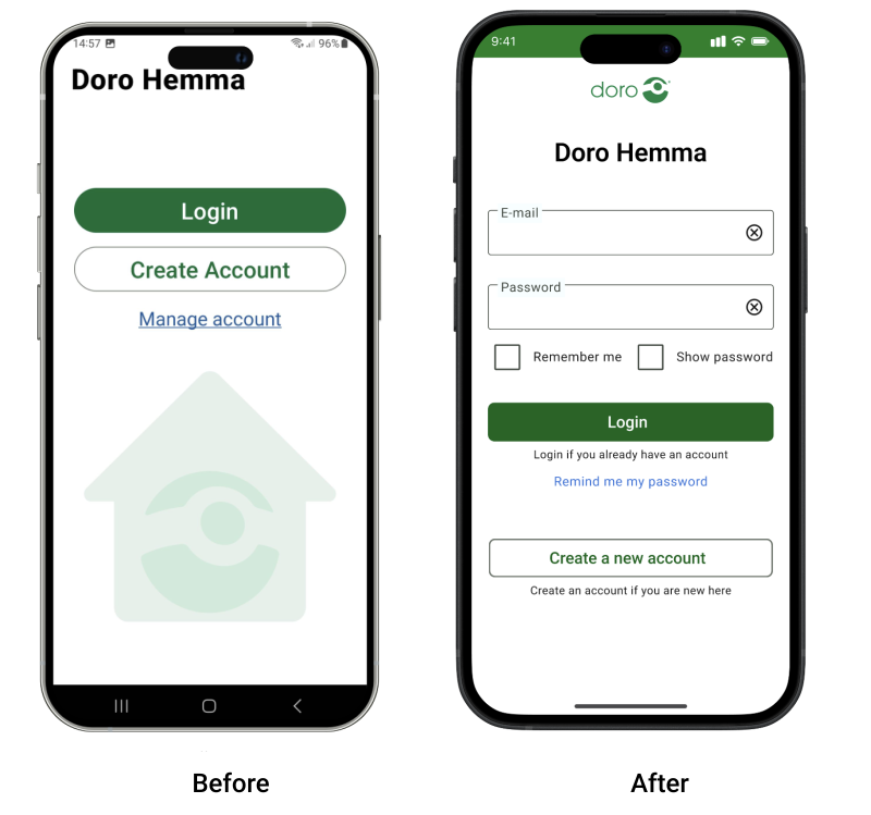
01. Simplifying the 'log in' and 'create account' flow
Log in directly
A/B testing showed that users preferred to go directly to the log-in page and choose the type of log-in there.
Explanatory text
To accommodate users who still happened to make the wrong choice, explanatory text was added below the buttons.
Show / delete password
To better support users with reduced motor skills, the Show/Hide and Delete password functions were separated.
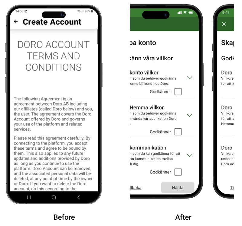
02. Simplification of terms and conditions
Combined terms
Three out of four terms and conditions have been combined into a single step, allowing users to accept them all at once.
Summary of the terms
A brief summary of the most important information is provided for each set of terms, with the option to read the full version if desired.
Clear acceptance choice
Users make a clear choice by either accepting or declining the terms.
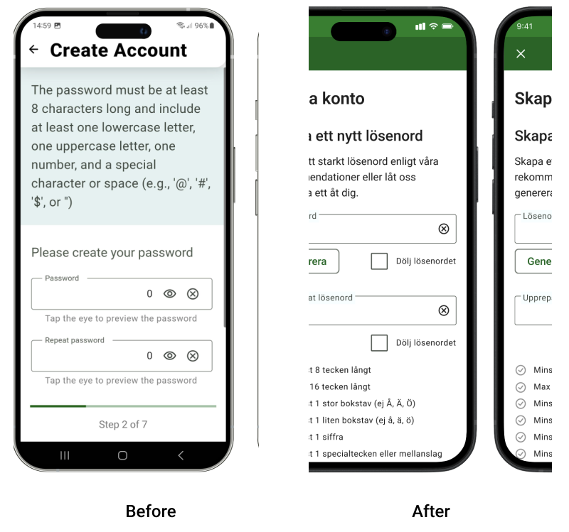
03. Create password
Generate password button
A feature that automatically generates a secure password.
Visible password
The password is shown by default, with the option to hide it if desired.
Interactive requirements
An interactive checklist of password requirements, where each requirement turns green once it has been met.
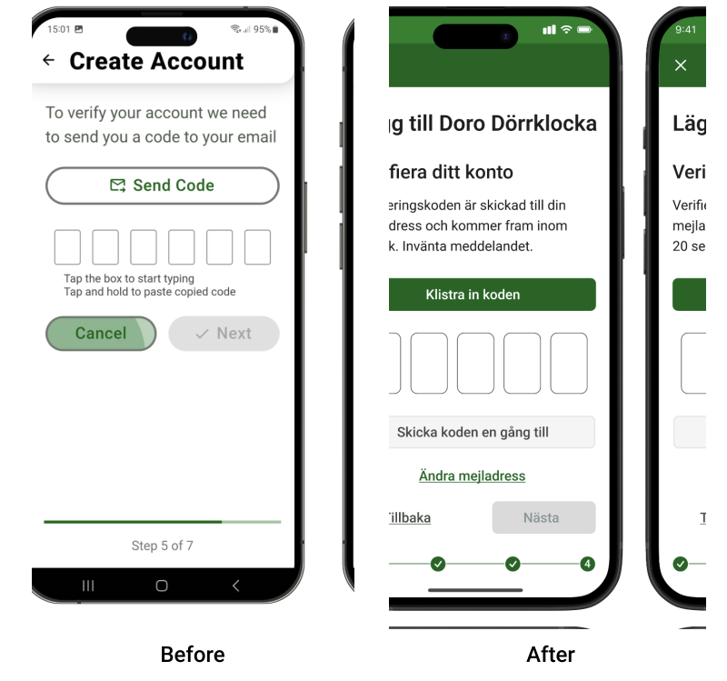
04. Verification code via email
Assistance during the transition
To make the transition between applications easier, assistance is provided from within Doro Hemma.
Copy / paste buttons
Users are given the option to easily copy the verification code from the email and paste it into Doro Hemma afterwards.
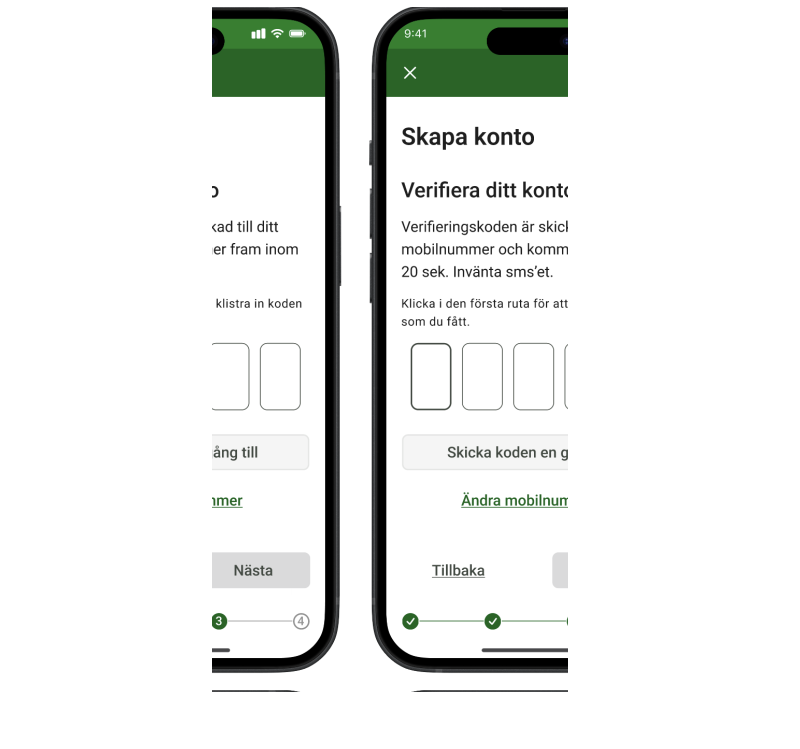
05. Verification code via SMS
Users prefer SMS
Testing showed that almost all participants were familiar with SMS verification and preferred it.
Simplicity
In this case, users do not need to leave the app or copy and manually enter the code.
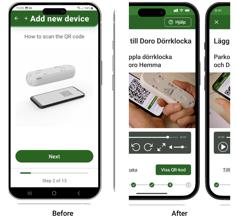
06. Connect the Doorbell to Doro Hemma
Problem with video instructions
At this stage, only a video tutorial is provided instead of text and images, as testing showed this was the step users found most unclear.
The video should clearly explain exactly how to scan, the correct distance to use, and which sound indicates that the pairing has been successful.
A/B testing also showed that almost all users preferred real recorded videos instead of 3D-generated ones.
QR code
A clear reference to the QR code has been added.
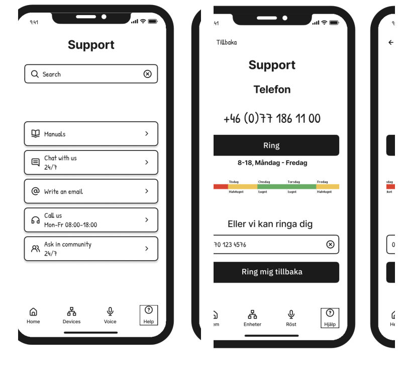
07. Improving of support flow
Users' expectations
When asked, "Is this what you would have expected if you had selected Help from the menu below?", 6 out of 7 participants answered "Yes."
The most popular support options were Instructions and Phone Calls.
The least popular support options were Community and Chat (especially chatbots).
Phone support
Users can call directly from the page and request a callback to the phone number provided during registration.
Testing and Iteration
We validated the redesigned onboarding experience through Think aloud usability testing and A/B testing. The sessions revealed how users navigated the prototype, where they hesitated and which design improvements were needed before the final iteration.
Impact
The project demonstrated how user-centred research can improve onboarding by addressing the entire installation experience rather than the mobile app alone.
Doro responded positively to the project and particularly appreciated that usability testing was conducted in participants' home environments, providing insights into real-world use.
Project outcomes
- Industry collaboration with Doro throughout the entire project.
- Research findings and design recommendations presented to the Doro team.
- Comprehensive research material that could support future product development.
- Recommendations for improving onboarding based on real user behaviour.
Implemented outcomes
- Four onboarding improvements were implemented in a product update following the project.
- A new collaboration between Doro and HejSenior was initiated.
- Research findings continued to support future product development.
- Research findings continued to support future product development.
Future opportunities
- Quick Start Guide included in the product packaging to support users before opening the app.
- Alternative onboarding flows tailored to different levels of digital confidence.
- More accessible guidance, such as voice assistance or AI-supported onboarding.
Reflection
This project reinforced that good onboarding extends far beyond the interface. Understanding the complete user journey, from opening the box to successfully completing the installation, was essential to designing a more accessible experience.
Working with Doro and conducting research with older adults strengthened my ability to translate user research into practical user-centered design decisions. It also showed me the importance of validating ideas through iterative testing and close collaboration with both users and stakeholders.